text text text
Ducky’s Island Adventure is a revival of visual production pipelines for video games in the 90s and early 2000s.
Creating with severe hardware limitations in mind, early video game artists brought life to their worlds using
intricate techniques innovated through experimentations in stylization. Today, this labor is disregarded as a
simple product of its time. This is especially relevant today in the wake of massive lay-offs and extensive exposés
of worker abuse in the games industry.
This 3D environment seeks to recognize decades of labor in gaming by
self-imposing similar hardware and software limitations in its production. In developing retro style visuals within
an industry leading modern game engine, early game development is paralleled in the necessity of research,
collaboration, and exploration of stylization to reverse-engineer the advancements of software that limit the mimicry
of early game console quirks.
Following this premise, the game has required extensive art production to come to life in the form of a demo. Below
is documentation of the process thus far. Use the menu to navigate to specific topics.
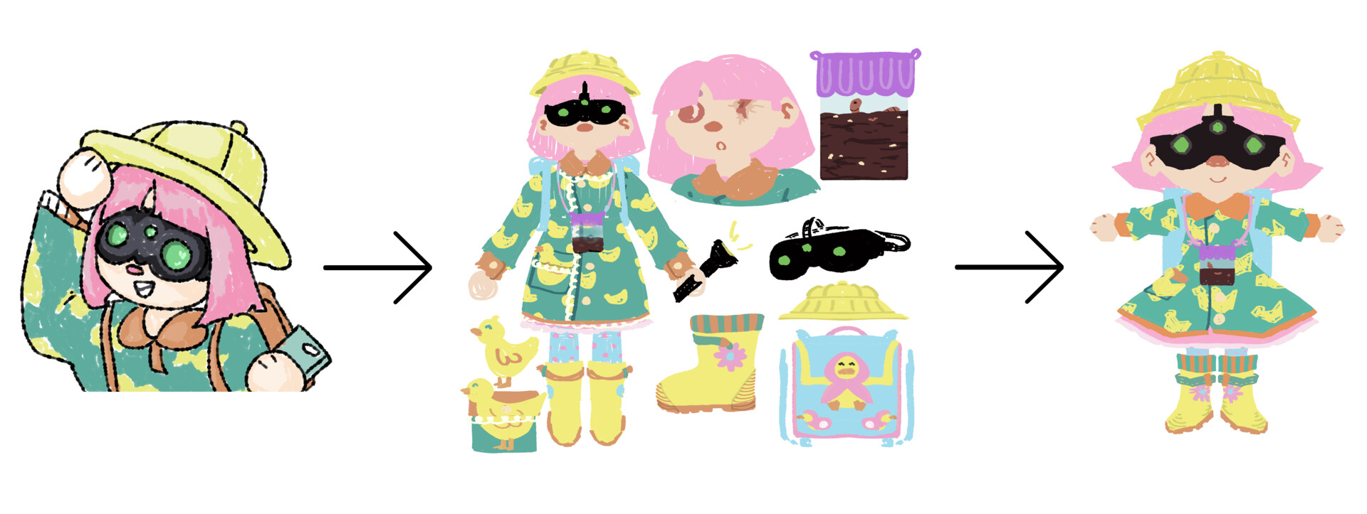
The titular character, Ducky, was extremely important to perfect before continuing with development. Early on, Ducky was intended to be a few years older, taller, and less accessorized. After a few experiments, Ducky was finalized as a first grader who loves ducks, is always prepared for an adventure in any weather-- carrying around random knick knacks in their bag-- and loves worms, even carrying their pet worm, Wormy, around their neck 24/7.
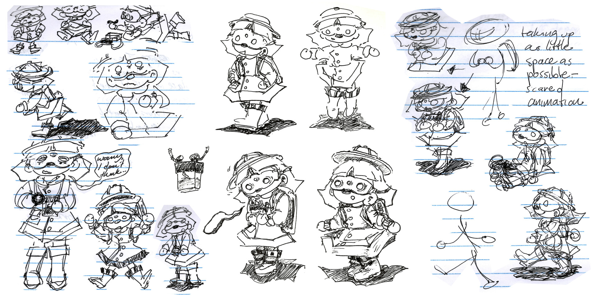
Ducky's Island Adventure was initially conceptualized as a series of 2D illustrations and sketches, with very different environments than the final product. After revisting those old illustrations, some concept sketches were developed to move towards an updated direction in tone and environment:
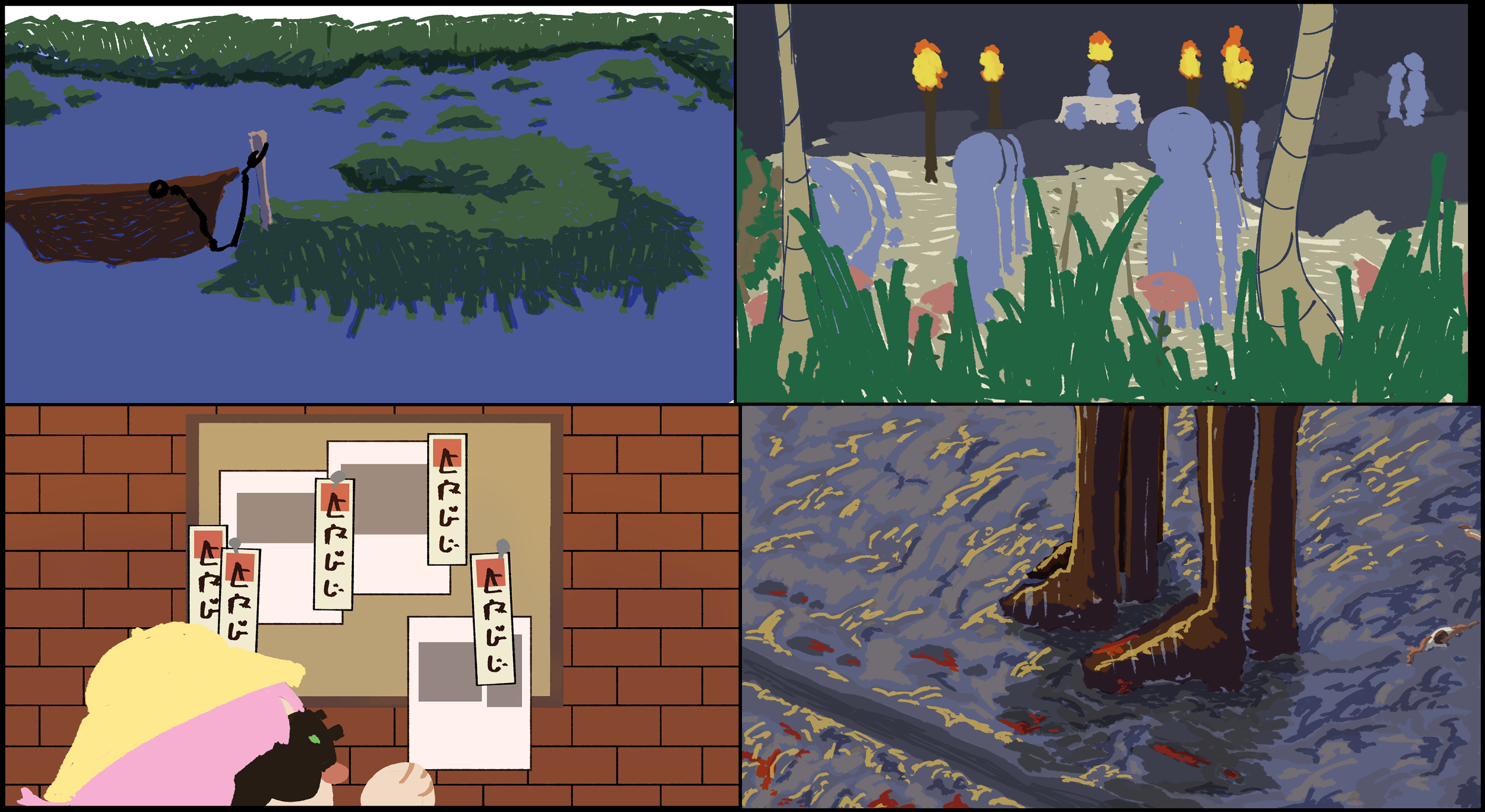
Early on, the island village's culture was heavily inspired by Aztec architecture and artwork. It's terrain was inspired by swamp environments like the Everglades. Considering these two elements, sketches were created to envision an island that felt tense but desolate, entirely empty but ordained in countless trinkets and religious artifacts, leaving traces of fear and past events for the player to explore. Digital devices are not present, and most items are hand-made by villagers using local resources. Ultimately, this is an environment that allows its residents to close themselves off from the rest of the world as they become more fearful. This phenomena should be evident in the environment-- the presence of religious artifacts, methods of entering the village are tampered with, everyday facilities see wear from a lack of maintenance, and so on.
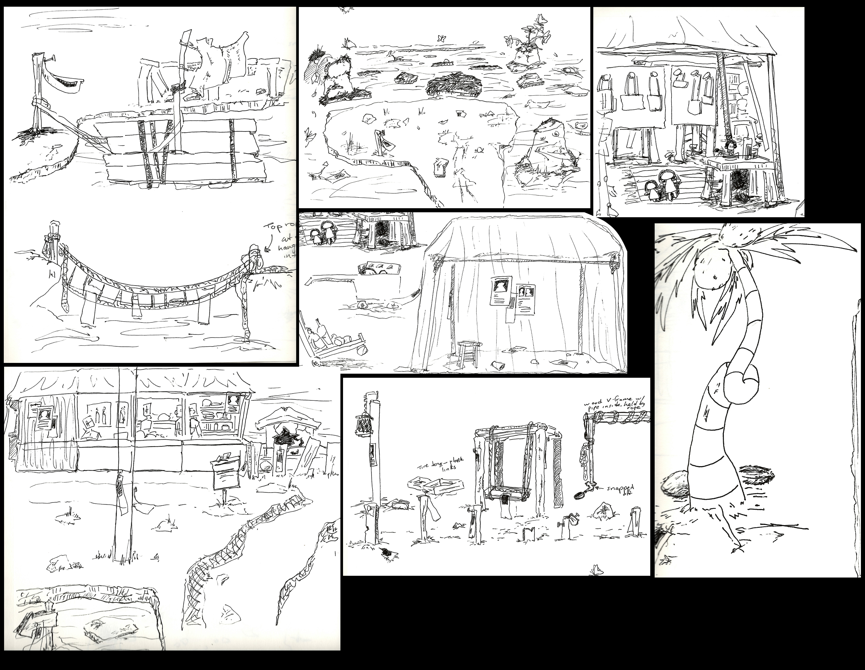
Pen sketches led to directly messing around in 3D programs to create environments reminiscent of these quick ideas, as well as some rendered concepts.
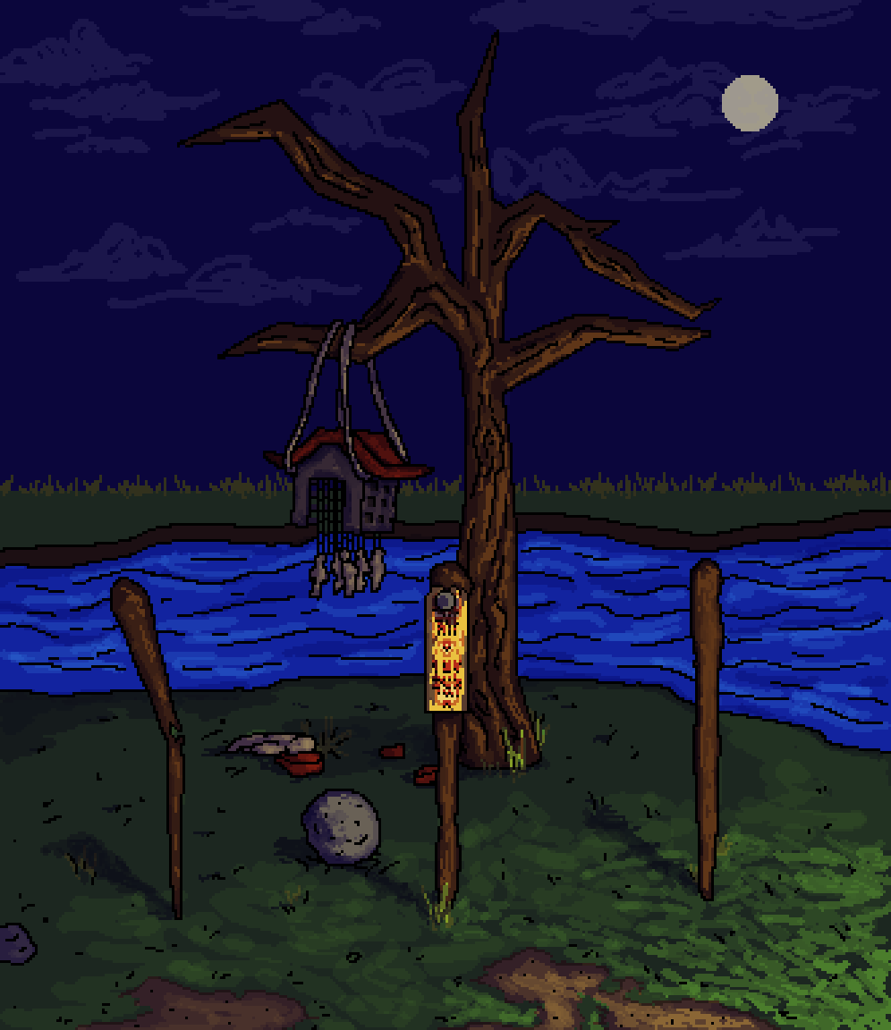
After delving into creating assets, inspiration from Aztec deities and color usage was mixed together with Buddhist imagery from China and Japan, Taoist Temple imagery in China, Shinto imagery in Japan, and spiritual imagery from Bulgarian Kukeri. Ultimately, the village became a polytheistic society that envisioned deities that were both human and animalistic, and always wore heavily ordained and distinct masks (heavily inspired by Mexica and Bulgarian Kukeri regalia). These were used as references for statues within the temple.
Since the goal was to emulate early character models, there were a few requirements in creating it:
Environment design was critical while working because it affected the atmosphere so deeply. After experimentating with keeping large bodies of ground low poly, it became clear that creating large chunks of spiky bodies of land with sharp edges. The large scale of the cliff-ends and the volume of the masses also accentuated how small Ducky was, making things feel more tense.
Similar to Ducky's character model, assets had to be low poly and hand painted, but still be recognizable after different post-processing effects are put in place. Almost all assets are made in Blender and manually unwrapped and UV mapped, and then hand painted textures are created in Aseprite.
Description of texturing work
Unreal contains a libary of animations by default for their base characters-- Manny and Quinn. Quinn is a grown woman, while
Manny is a tall, burly, adult man. Neither character's animations would suit a primary school child character in a way that
would embody Ducky's personality. A custom walk cycle had to be created to solve this problem.
Ducky's animation rig was put together by using Mixamo's free service. From there, the skeleton was imported to Blender to begin
animating their walk cycle.
Initially, Ducky's walk was going to be a simple march-- rhythmic, bouncy, and cute! After animating some of the frames, the walk
felt too generic. Ducky carries so many unique accessories: a giant backpack, oversized rainboots, a worm enclosure necklace, night
vision goggles, a preschooler hat... I realized true custom animations for them would be one that utilizes their accessories
in different ways. This walk cycle was born from that conclusion:
It quickly became clear that a start screen was necessary to orient the player, and a load screen for hiding the few seconds it takes for textures to load into each map. As such, I sketched some compositions on paper for a start screen:
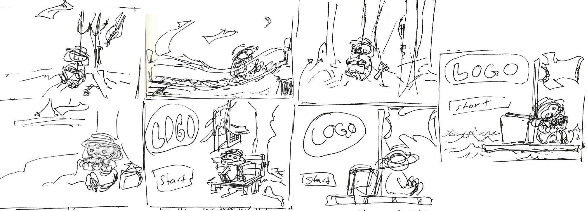
After that, I set on continuing with 6 out of 7 of the initial pen sketches, and created more detailed sketches within aseprite.
Each composition is done in a size of 512px x 384px. This is done to keep the composition in the final aspect ratio the game
is played in. When complete, the start screen illustration is exported at 200% size to fit the 1024px x 768px game resolution
and maintain a more pixelated look.
The 6 sketches are compiled below. Color was not figured out yet, but layer modes were used to make decisions about the lighting
of the illustrations. (Each image is in its original 512px x 384px size.)
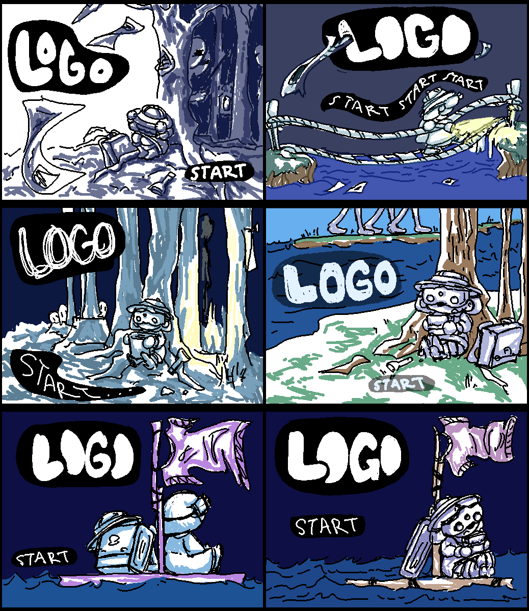
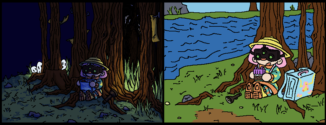
After gathering feedback, compositions 3, 4, and 5 were the best received, and I decided to pursue 4 and 5. Ultimately, after issues encountered with Day/night cycles on the project, I settled on only having a night setting and chose the left composition for the start screeen.
Unreal Engine is an engine typically used to push the bounds of 3D visuals, exploring realism and complex stylization for the sake of game development and video production. However, small communities of visual artists and game enthusiasts use the engine to produce projects stylized to mimic early video games-- both 2D and 3D! Below is documentation of experimentation within Unreal Engine 4 to create Ducky's Island Adventure in a way that mimic'd quirks of the Playstation and DS.
Diferent steps towards achieving a retro look were taken within the program.
Some objects felt better to illustrate within Aseprite than model and texture in order to maintain their thin,
delicate look. For example, flowers, talismans, bushes and leaves were created as 2D images and never modeled.
Making 2D Look 3D
2D images were made to look 3D by applying them to frames, using Unreal's alphacomposite material settings, and
then duplicating the planes and overlapping them (2-5 planes total) in order to give the impression of volume. this
process was done for early games looking to create realistic foliage and shrubs. When moving around the planes in combination
with post processing pixelization effects, the bushes look strange and uncanny, adding to the tension of the environment.
Adding Detail Using 2D Images
The terrain of the island has detail, but is low poly for what it is-- ground with leveling, ditches, and so much more. As
a result, 2D images were used to breathe life into the flat models Ducky would walk on.
Grass was drawn in 2D to be placed upon the ground, giving the impression that it is real enough to sprout life. Paths
were and patches of dirt amongst the grass were illustrated to guide the player and give the world a feeling that this village
was not desolate-- people had lived within it, carving it to their day-to-day needs.